Leuchtreklame Aussenbereich mit Leuchtwürfel für Fernwirkung
Wie die W. Wiedmer AG zu einer starken Bildmarke kommt.
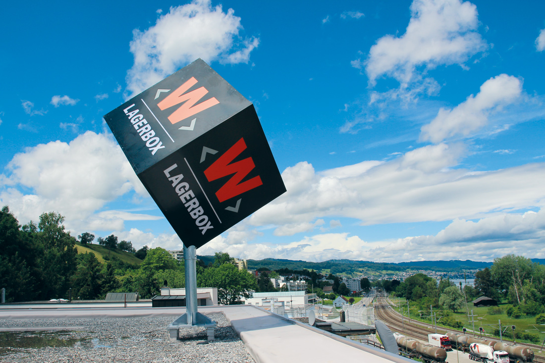
Er beeindruckt schon von Weitem und vermittelt den Eindruck, als würde er schweben. Doch so leicht er auch aussieht, hinter dem neuen Leuchtwürfel auf dem Gebäude der W. Wiedmer AG steckt Schwerstarbeit. Wie kam die tonnenschwere Stahlkonstruktion auf das Dach der Umzugsfirma?
Für solche Herausforderungen zählt Frontwork auf langjährige Erfahrung und auf hochmotivierte Mitarbeitende. Ein Fachteam verschraubte den Standfuss des zwei Meter grossen Würfels mit einer Lastenverteilungskonstruktion auf die Dachsekuranten. Die Beschriftung ist dekupiert, flach, mit weissem Acrylglas hinterlegt und zusätzlich foliert. Vorinstallierte HQL-Lampen leuchten den würfelförmigen Markenauftritt aus. Verantwortlich für die Bauleitung zeichnet die Kern Studer AG. Eine geplante Dachsanierung kam dem Projekt entgegen. So konnte die Verankerung des Leuchtwürfels bereits in der Bauphase eingeplant werden.
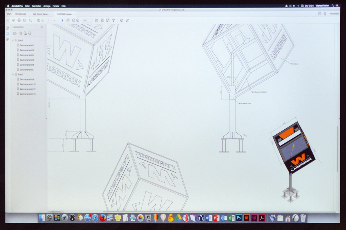
Fotomontage und Skizze des Leuchtwürfels
Für solche Herausforderungen zählt Frontwork auf langjährige Erfahrung und auf hochmotivierte Mitarbeitende
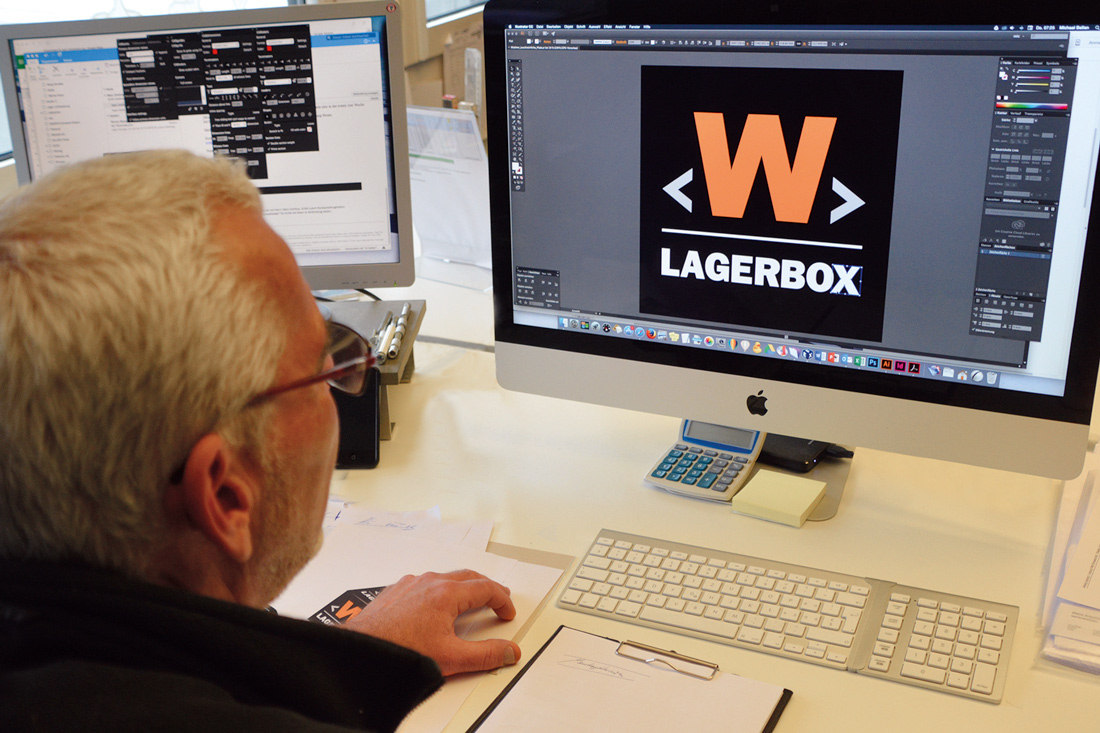
«Das beste Lager ist ausser Haus» – so lautet das Motto der W. Wiedmer AG. Der Würfel steht mit einem prägnanten, orange-grauen «W» auf schwarzem Hintergrund als Sinnbild für die Lagerboxen. Die Fotomontage hatte der Kunde gefertigt, Frontwork hatte sie umgesetzt.
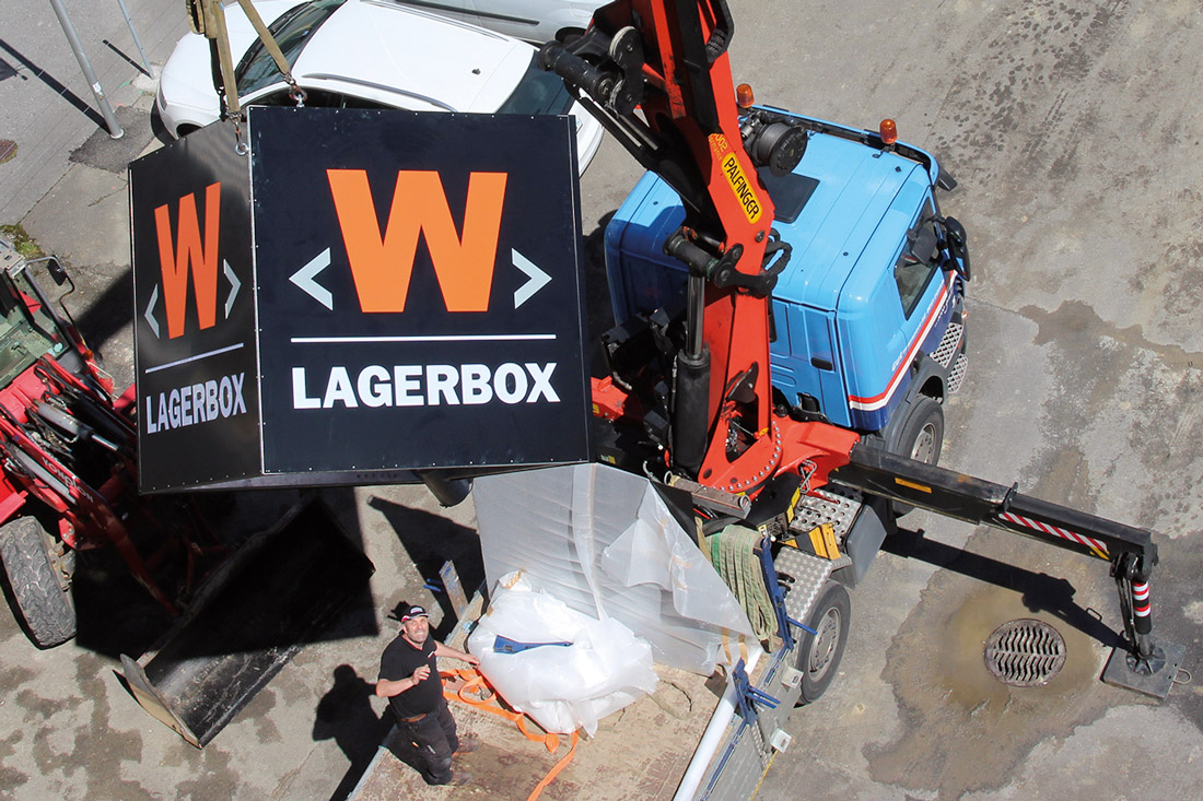
Montage der tonnenschweren Stahlkonstruktion mit dem LKW-Kran
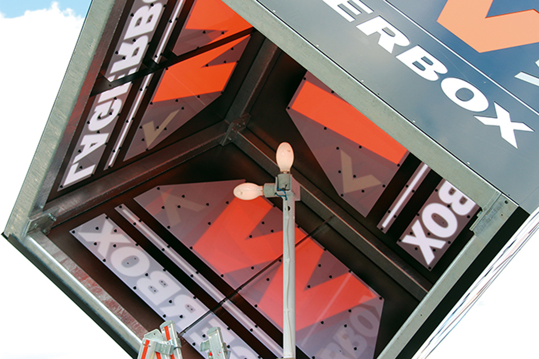
Vorinstallierte HQL-Lampen leuchten den würfelförmigen Markenauftritt aus
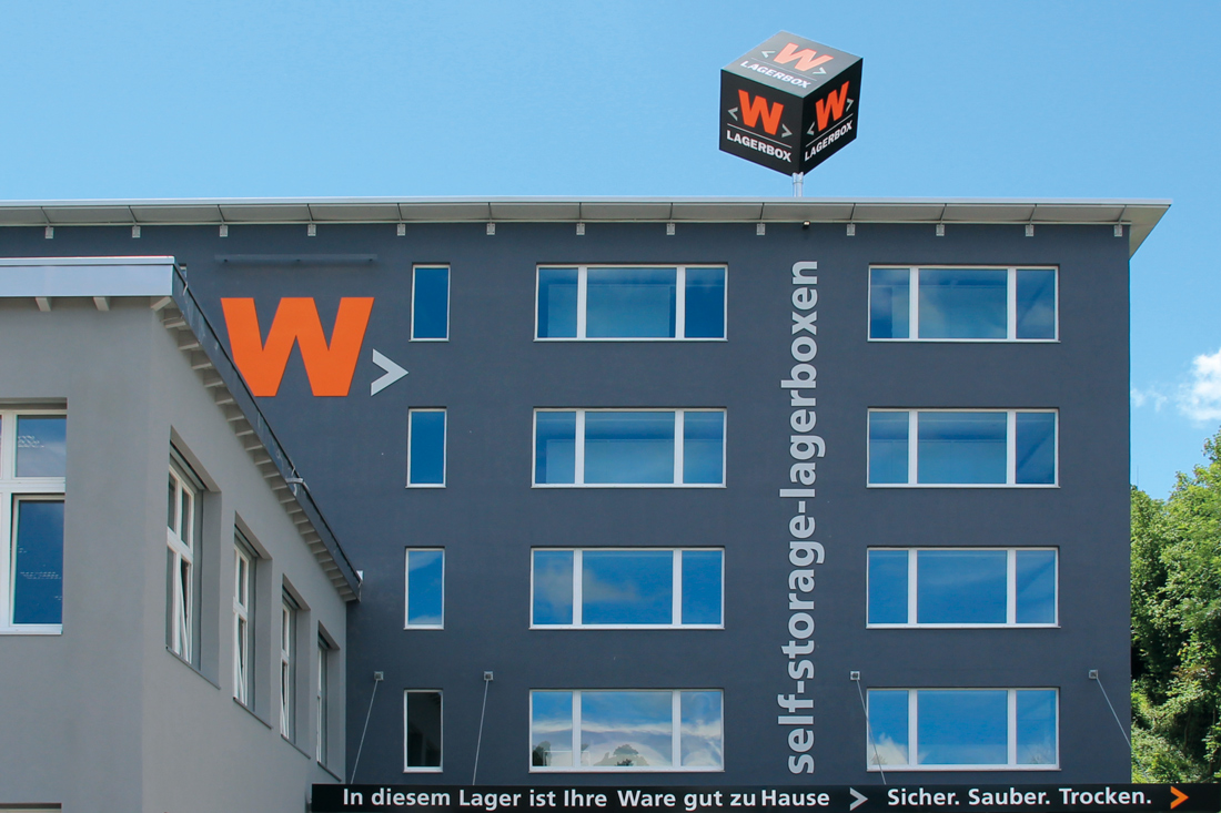
Der Leuchtwürfel vermittelt den Eindruck, als würde er schweben
Making-of: Leuchtwürfel mit Fernwirkung
Das Frontwork Fachteam verschraubte den Standfuss mit einer Lastenverteilungskonstruktion auf den Dachsekuranten
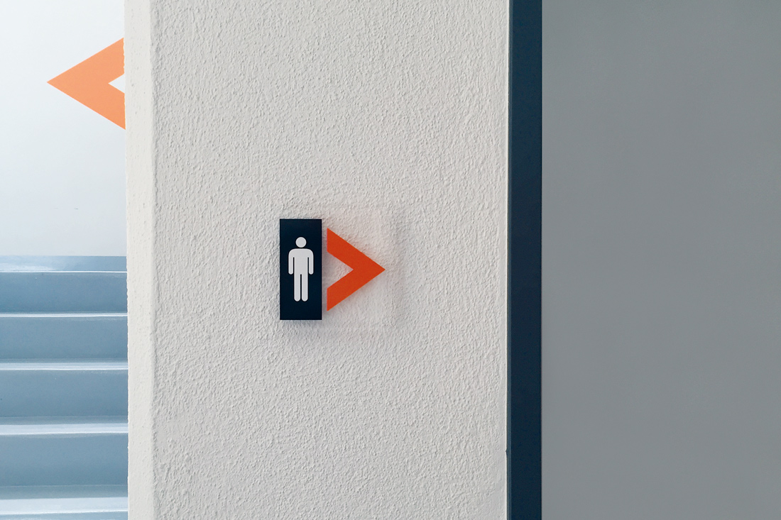
Beschriftung im Innenbereich schafft Orientierung

Beschriftung im Aussenbereich
Alles aus einer Hand
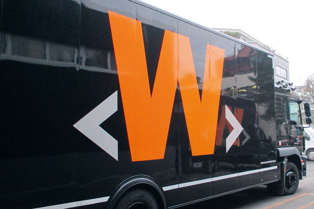
Vor einigen Jahren hat Frontwork weitere Firmenstandorte umgerüstet. Auf den Hecks der Firmen-LKWs steht der Claim «Auf Wiedmersehen», die Seiten sind mit dem «W» der W. Wiedmer AG beschriftet. Die einfache Beschriftung der Lagerboxen, Leuchtwerbung und Piktogramme schafft eine klare Orientierung. Die W. Wiedmer AG ist sehr zufrieden, dass sie alles aus einer Hand erhält und einen kompetenten Ansprechpartner an ihrer Seite hat.
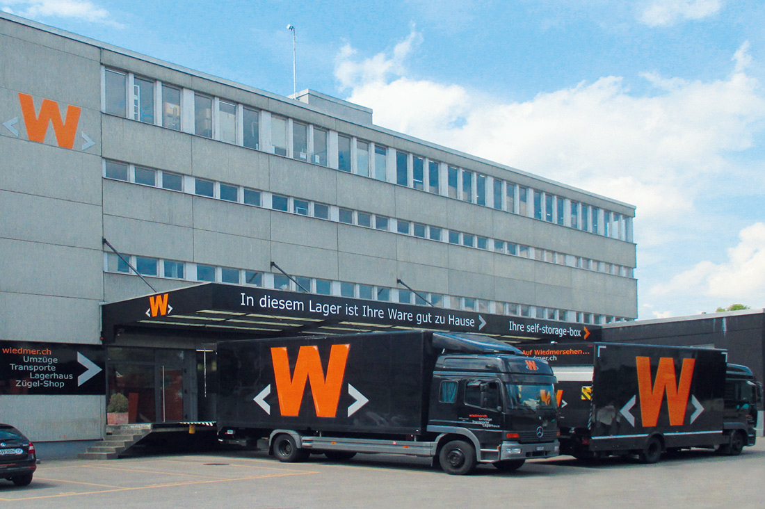
Die Firmen-LKW Seiten sind mit dem «W» der W. Wiedmer AG beschriftet


Grossformatige Aussenbeschriftung der Fassade