Signage for Wägelwiesen Care and Retirement Centre
Signage in a nutshell!
How can we ensure that everyone finds their way around easily in a care and retirement home?
With dots of course! Coloured dots shine cheerfully like confetti on the walls, signs and glass panels of the Care and Retirement Centre.
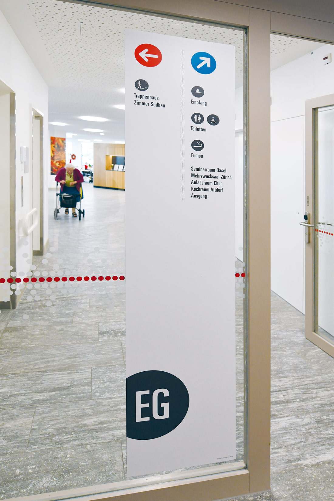
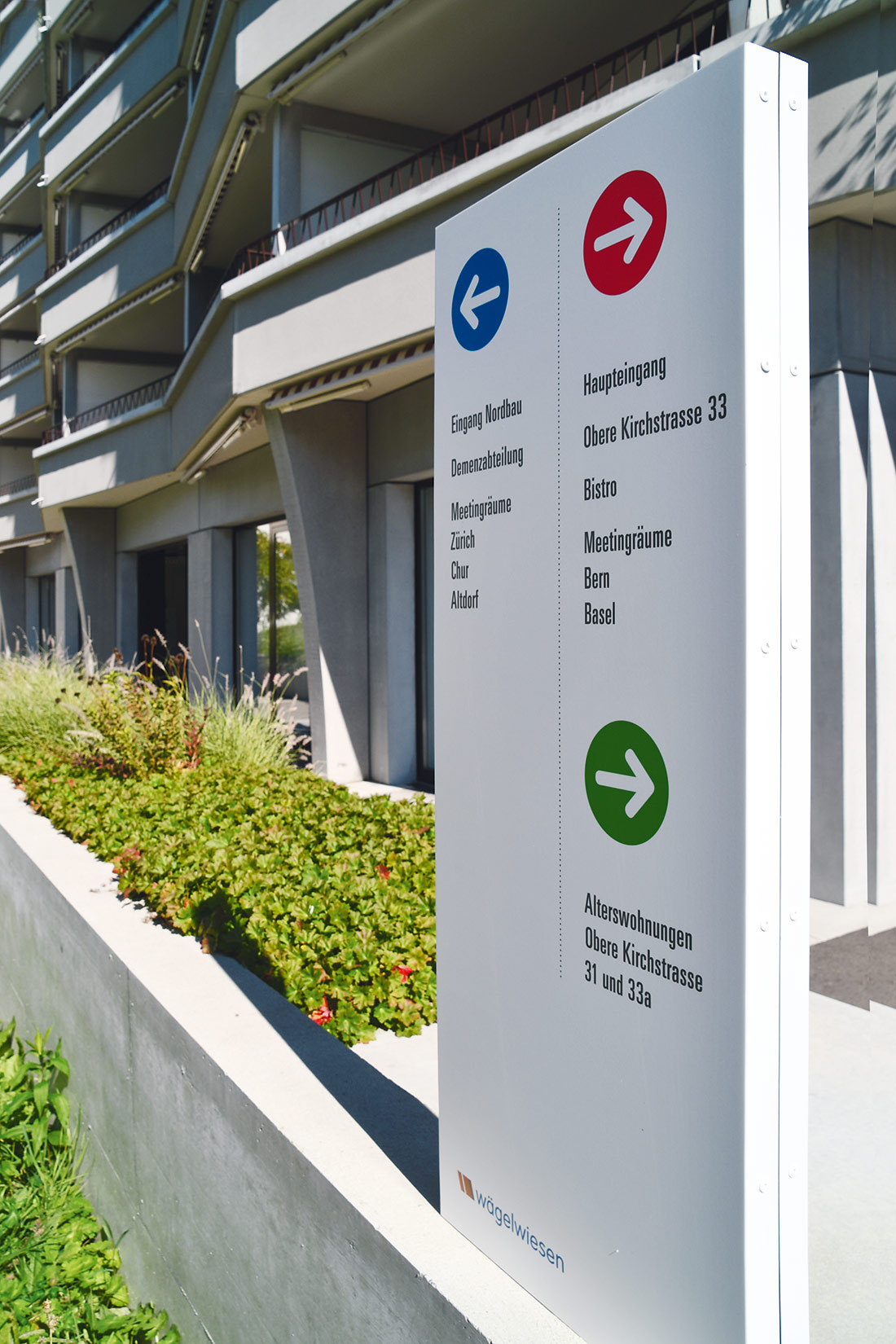
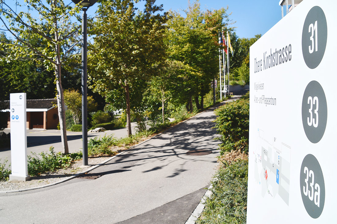
People looking for the way can quickly find out in which of the three areas they are from the respective colours. Three area colours were used to colour-code the old and new building. The north wing is decorated entirely in blue, while the south wing is in red. The apartments for the elderly at the locations Obere Kirchstrasse 31 and 33a are marked in green.
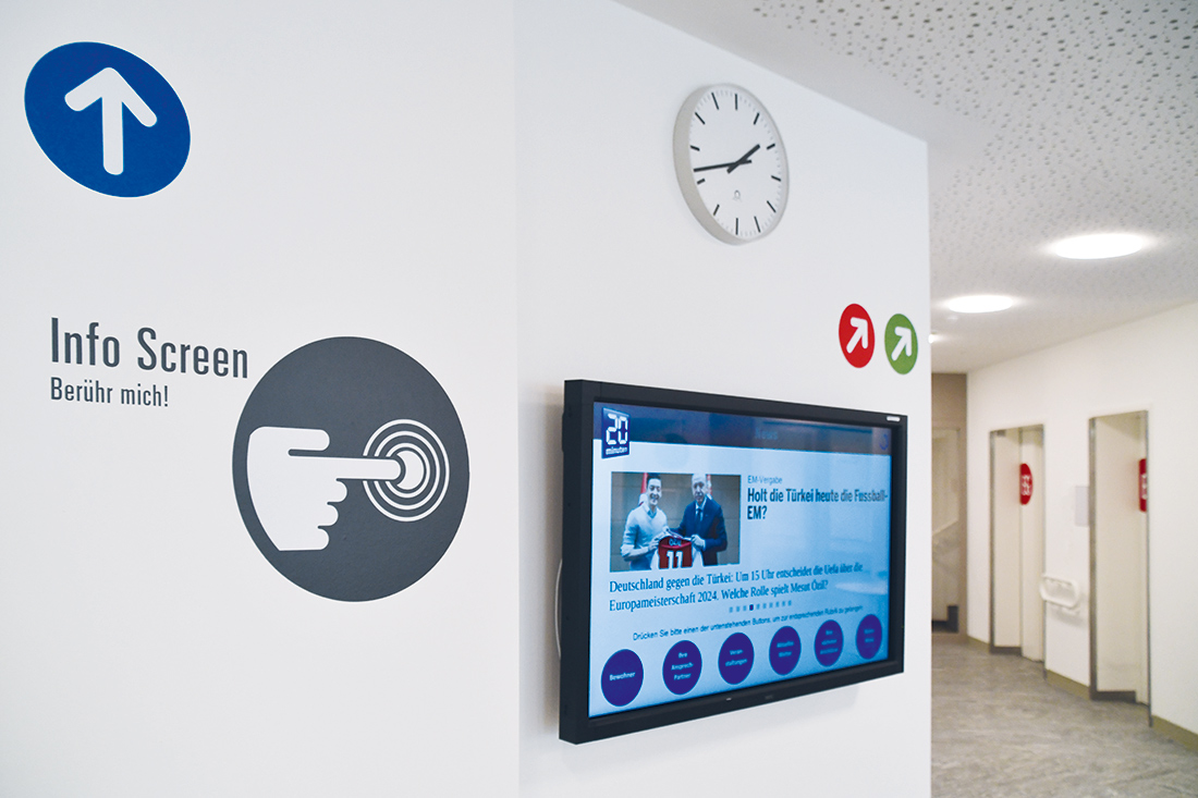
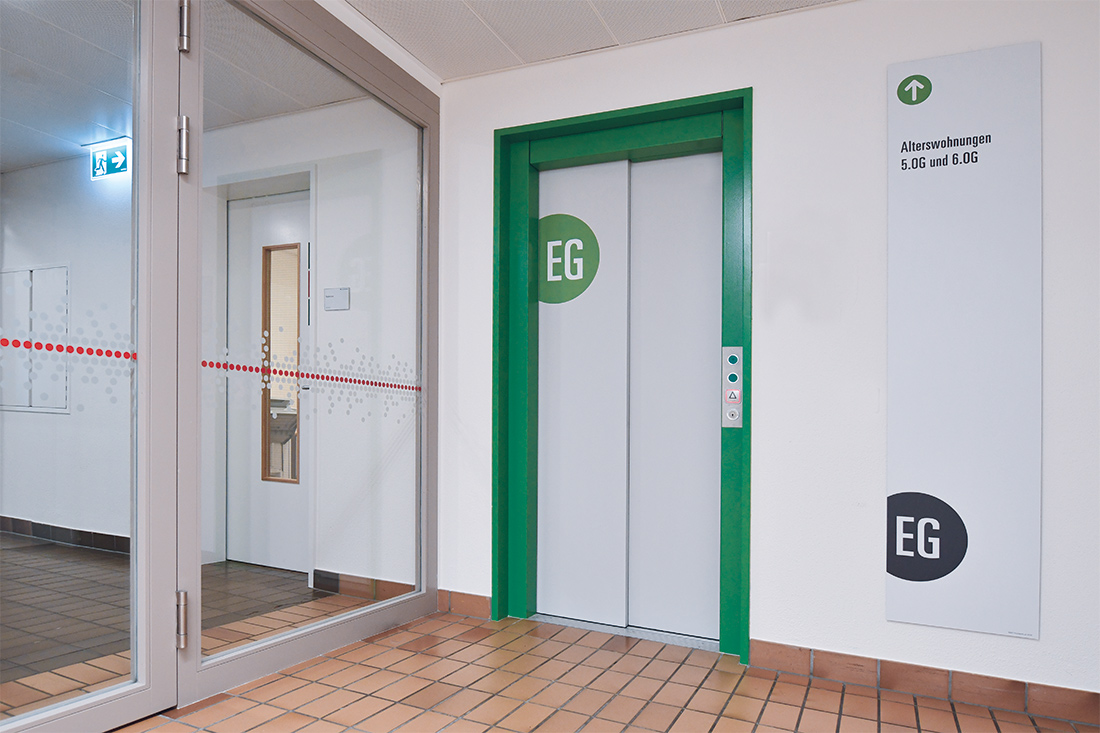
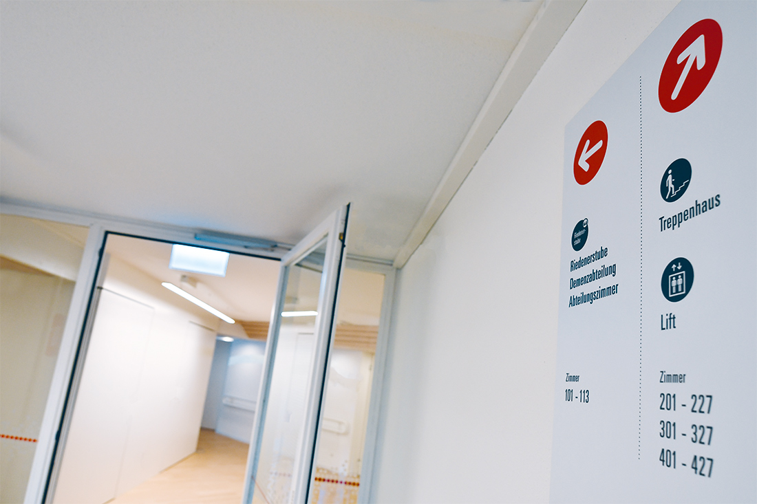
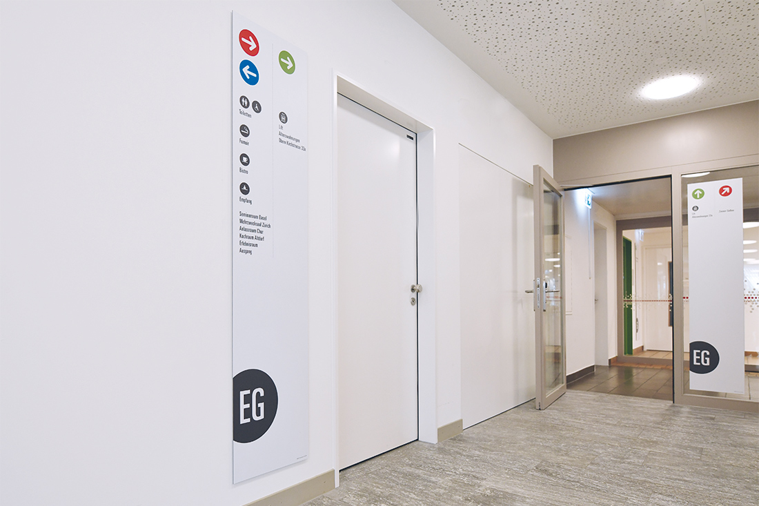
The coloured signage dots can be found throughout the building on the sliding glass doors of the entrance, on privacy shields and floor labels.
We use the same shape and colour on the orientation boards on the lift and on the floors. The underground path connections also follow the dot principle. Thus, both inhabitants and visitors can easily and safely find their way around.

Arriving on the dot...
The dot design was not chosen at random; it was adopted as a recognisable element. This choice was suggested by the existing round ceiling panels and fountain at the entrance. Recognition starts at the steles in the outdoor area and continues from there consistently into the interior of the building. The circular opening hours in the bistro or location marking of the parking lots in the garage ensure that everyone gets where they want to be «on the dot».
Easy for elderly inhabitants
How can the surroundings of elderly people be made simpler without disturbing them? By making them curious! Bright colours should be used to make the inhabitants really inquisitive. Our team was often asked, what’s going on and what for. It was a welcome change in our routine and a lovely development, since we enjoyed this direct contact as much as the local inhabitants.
Human communication
A very special requirement of this project was formulated by the Chief of the facility Roland Fankhauser himself. He requested that the ongoing operation was not disturbed.
And that everyone – inhabitants, visitors and employees – could find their way around safely. The fact that the signage in the healthcare buildings also contributed to communication and thus sustainably anchored the pathway in the memory was a pleasant side effect.
Caring and above all very humane
Mr. Roland Fankhauser noted after completion: «This project is about much more than just presenting old and new buildings as a unit or using the new direction signs to refer to the additional apartments for the elderly and conference rooms with a separate entrance. Frontwork conducted their work professionally, smoothly and constructively – but also in a very caring and, above all, humane way.»
Customer value added
Every reworked element is encoded and captured in a systematic manner. The customer can make changes or place additional orders at any time. This means the direction signs can be easily replaced, changed or reordered in a time-saving and unequivocal manner.

Our bottom line
The signage is focused on the individual needs of the inhabitants, visitors and employees. Seeing how the inhabitants react to our work was a really special experience. It enabled us to determine something: Our contribution is more than just labelling the building or putting signage in healthcare institutions – we ensure positive topics of discussion and make everyday life a bit «brighter». We believe that the successful completion of the project was a winner with more than just the centre’s management team – and that’s a fantastic feeling!